Opal Largo Station
Brand Identity
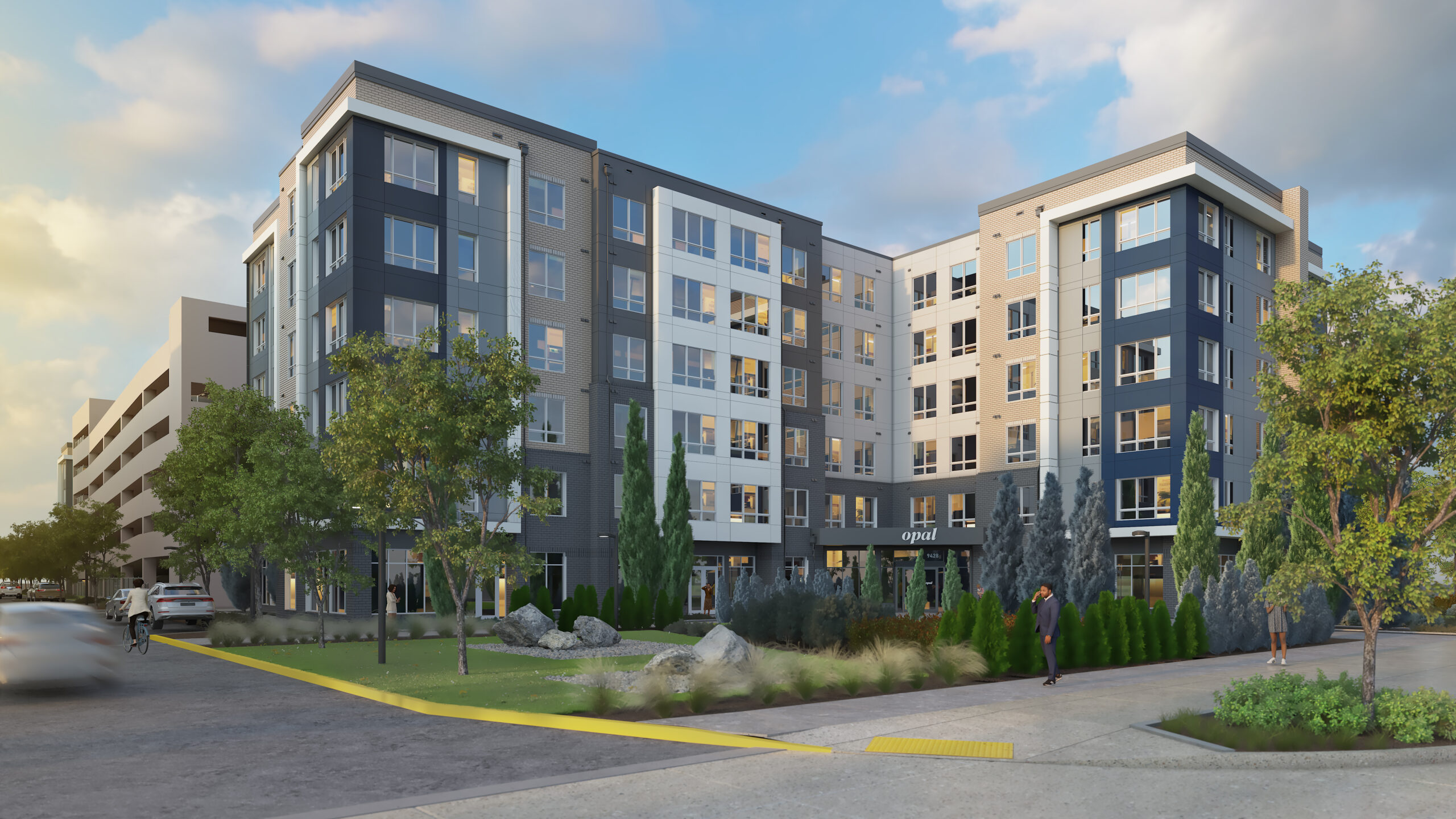
Opal Largo Station is a luxury apartment complex in Largo, Maryland, a suburban area minutes away from Washington D.C. An ethereal identity system was developed that encapsulates the peace and relaxation Opal residents can enjoy while being a few stations away from the bustling capital.
Project under Ashton Design x Dolben & Klein Enterprises
ROLE
Brand identity
Design direction
Graphic design
Motion graphics
CREDITS
Jenny Hoffman, creative direction
Fat Lip / Meg Dillon, naming, strategy, copywriting
Brian Ahola & Zach Kotel, signage & wayfinding
Visual IDENTITY
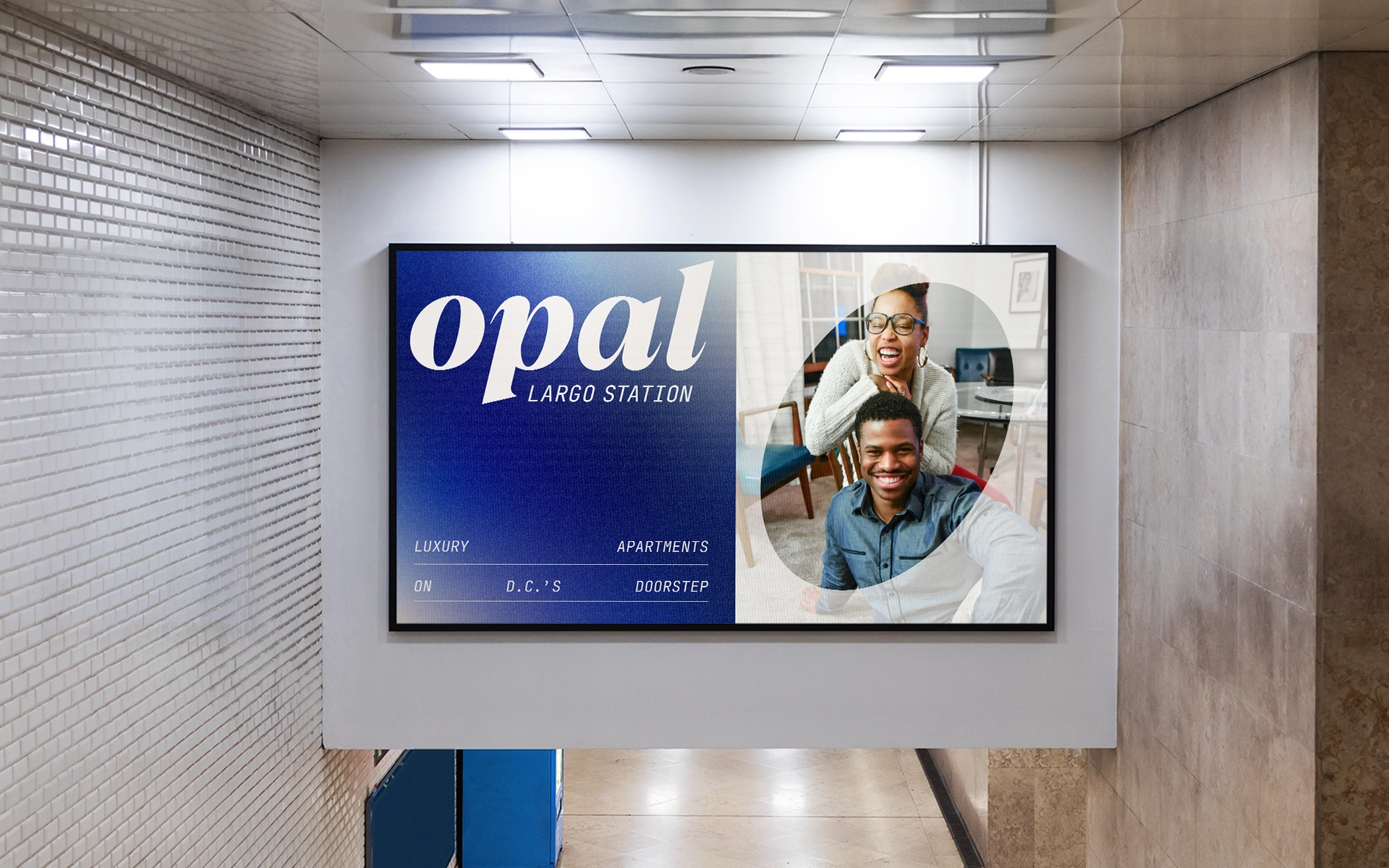
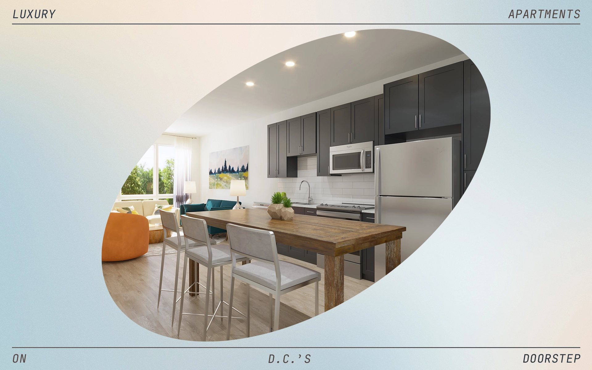
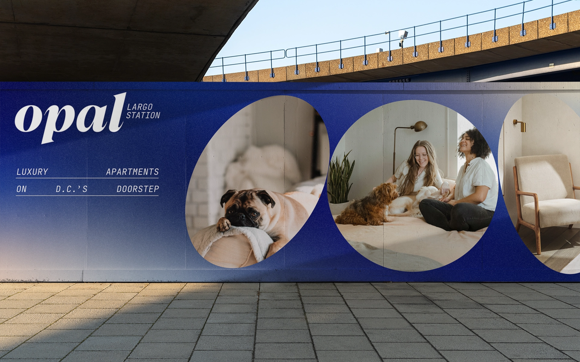
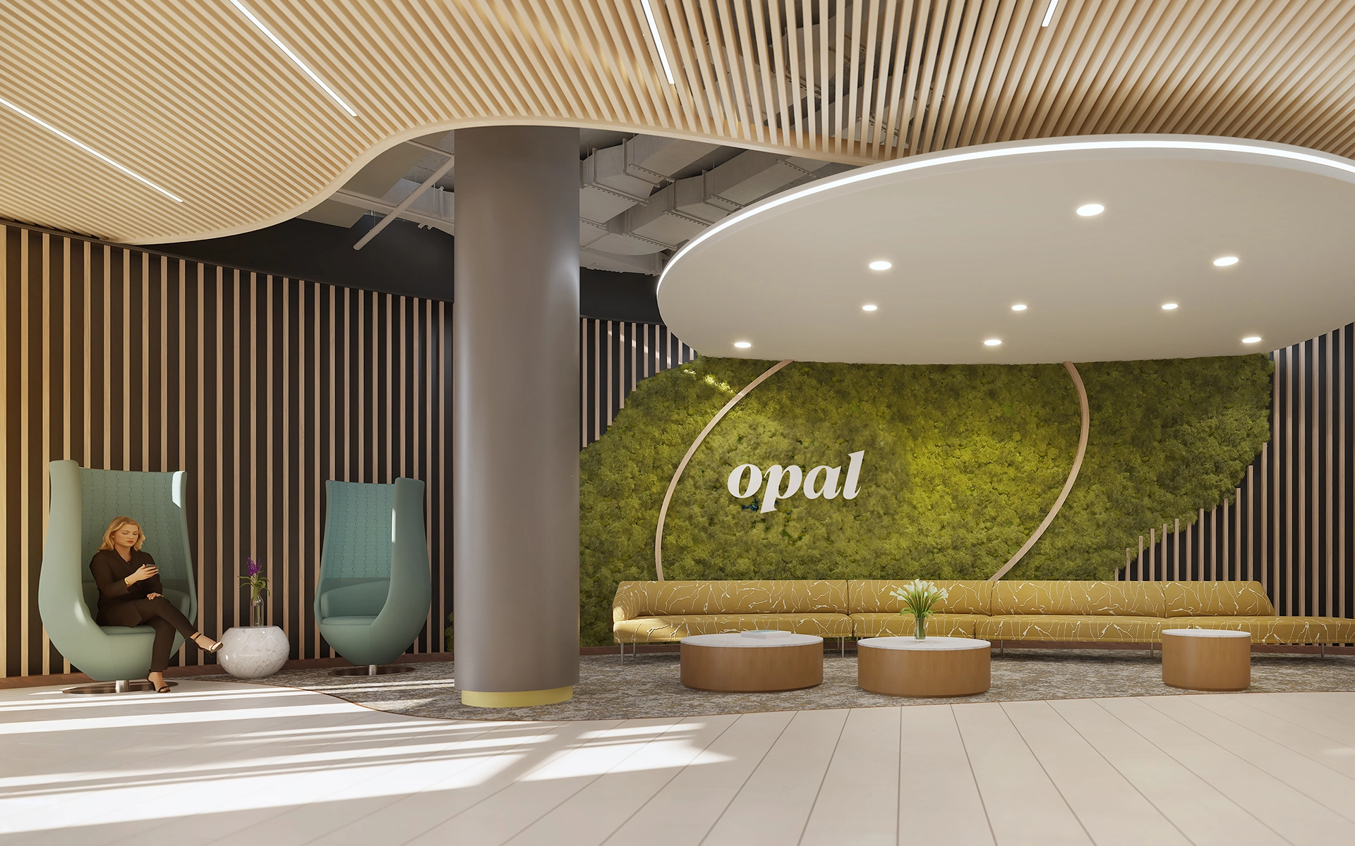
The building interiors feature circular fixtures and curved elements. Viewed from different angles, these circular elements appear as ovals, influencing the amorphous shape featured in the identity.
COLOR PALETTE
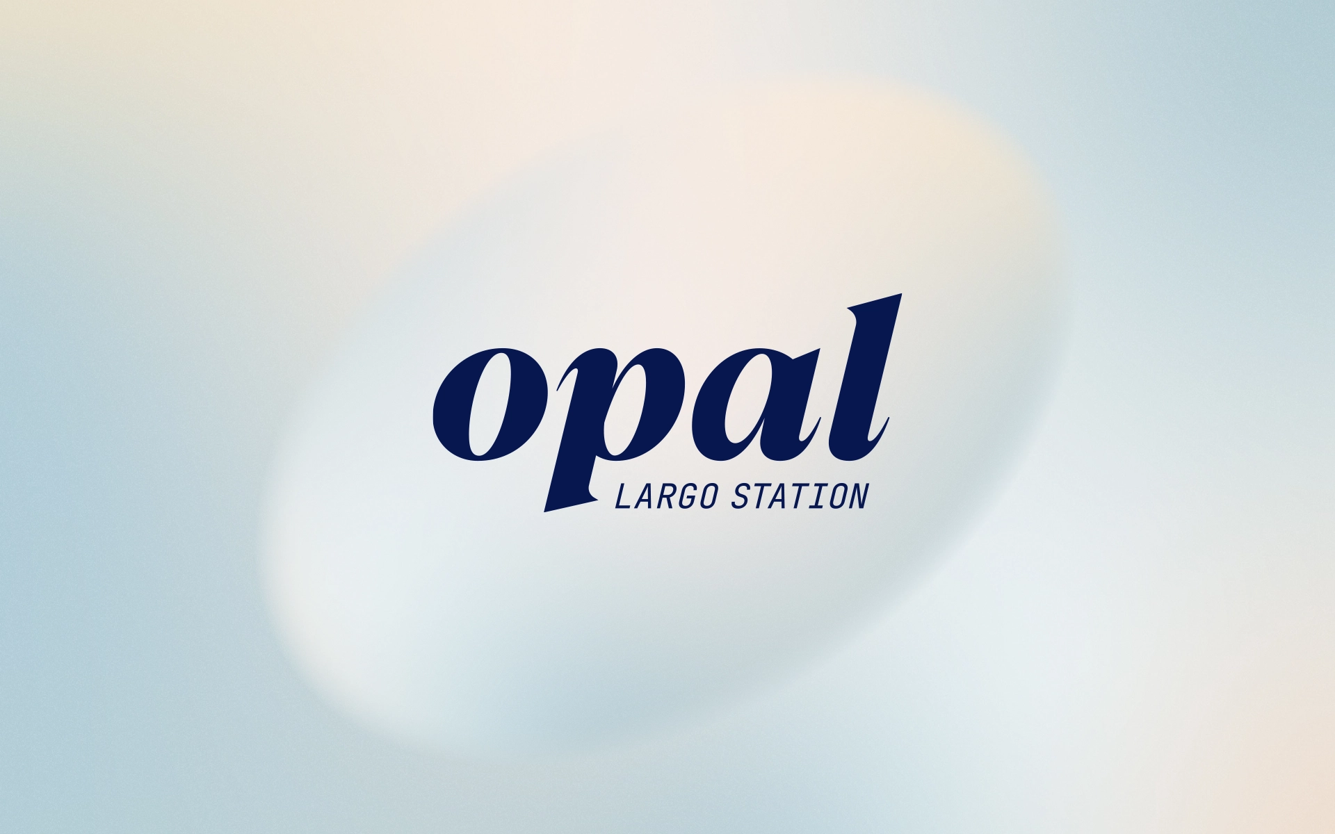
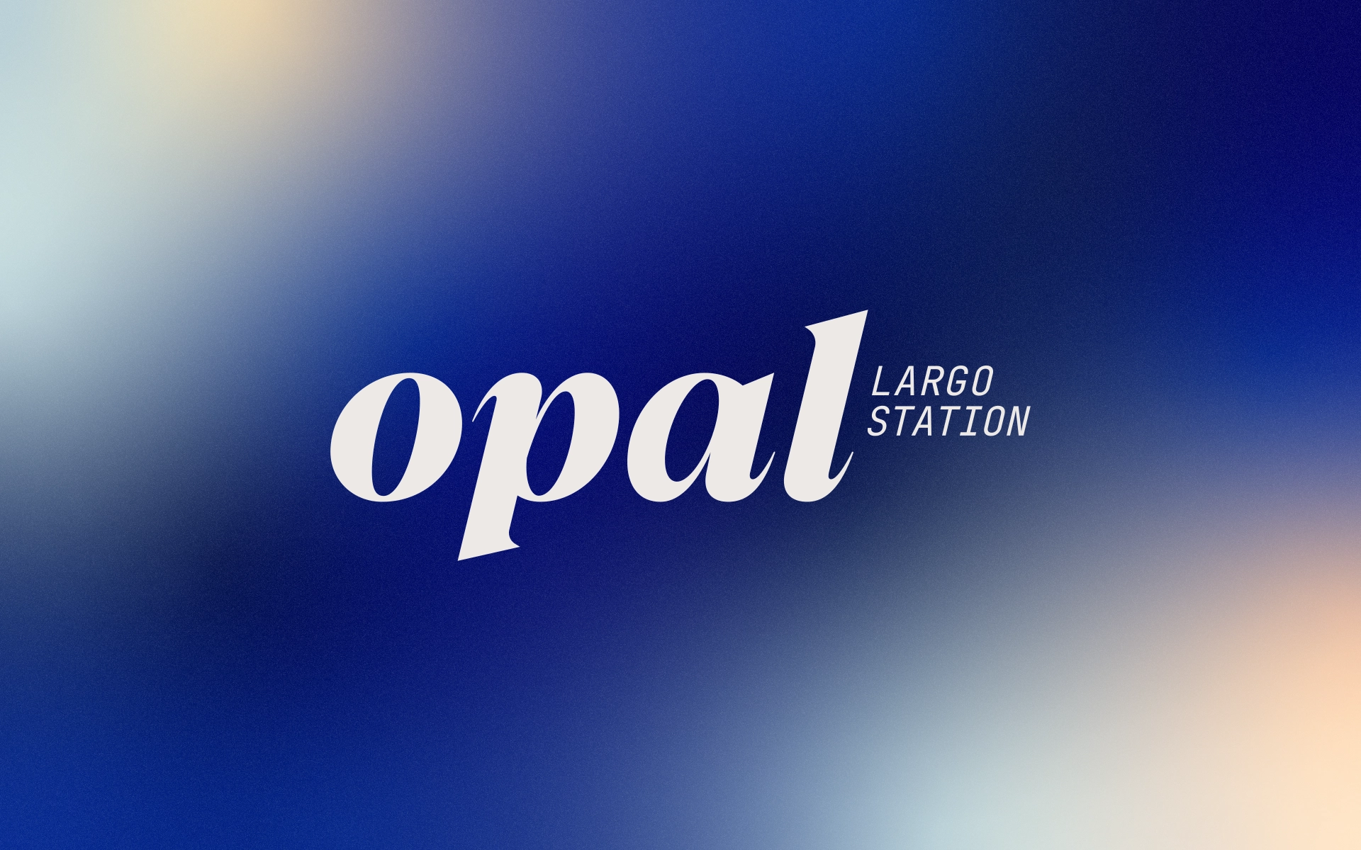
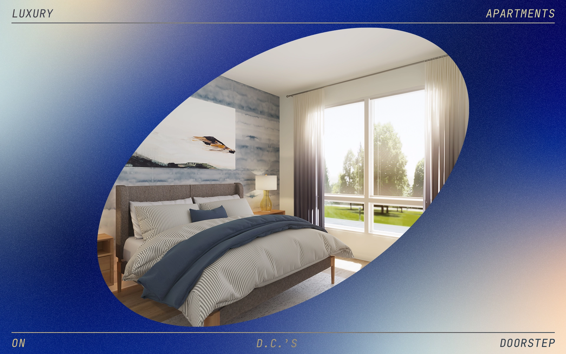
Unique to the Opal's identity system are the light/dark color palettes, communicating the peace and relaxation residents can feel no matter what time of day.
OPal ON PRINT
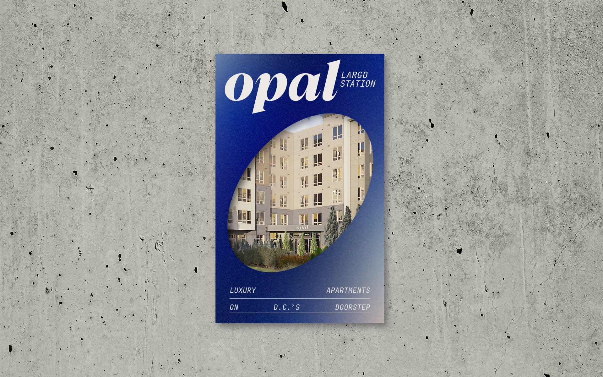
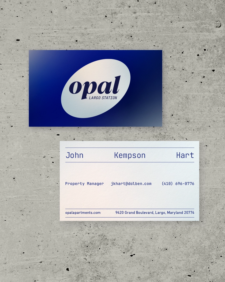
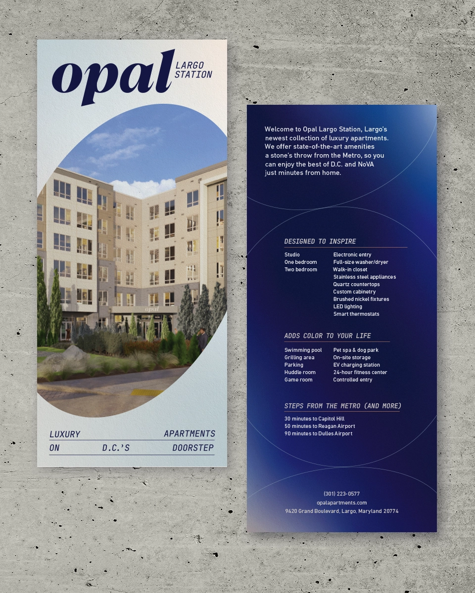
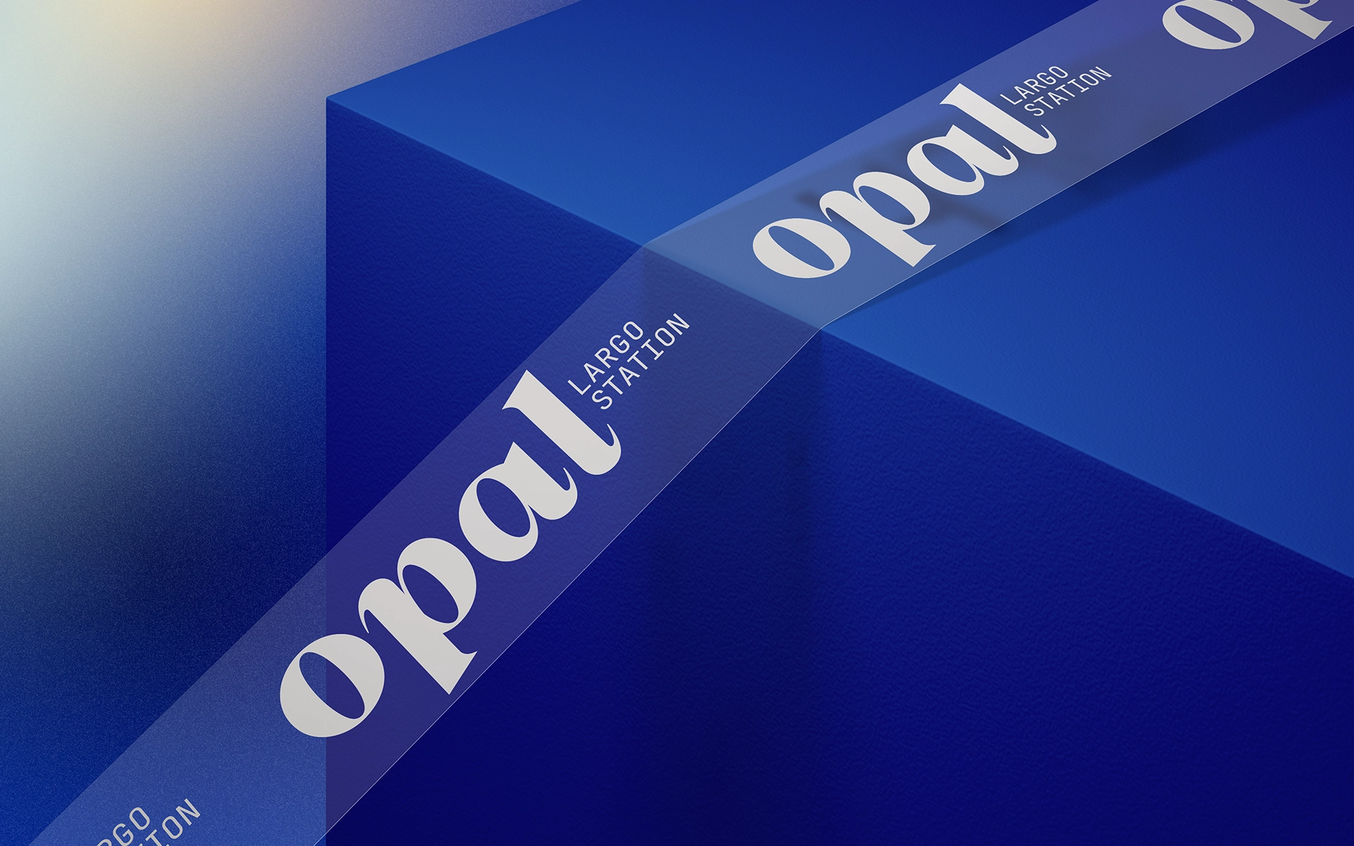
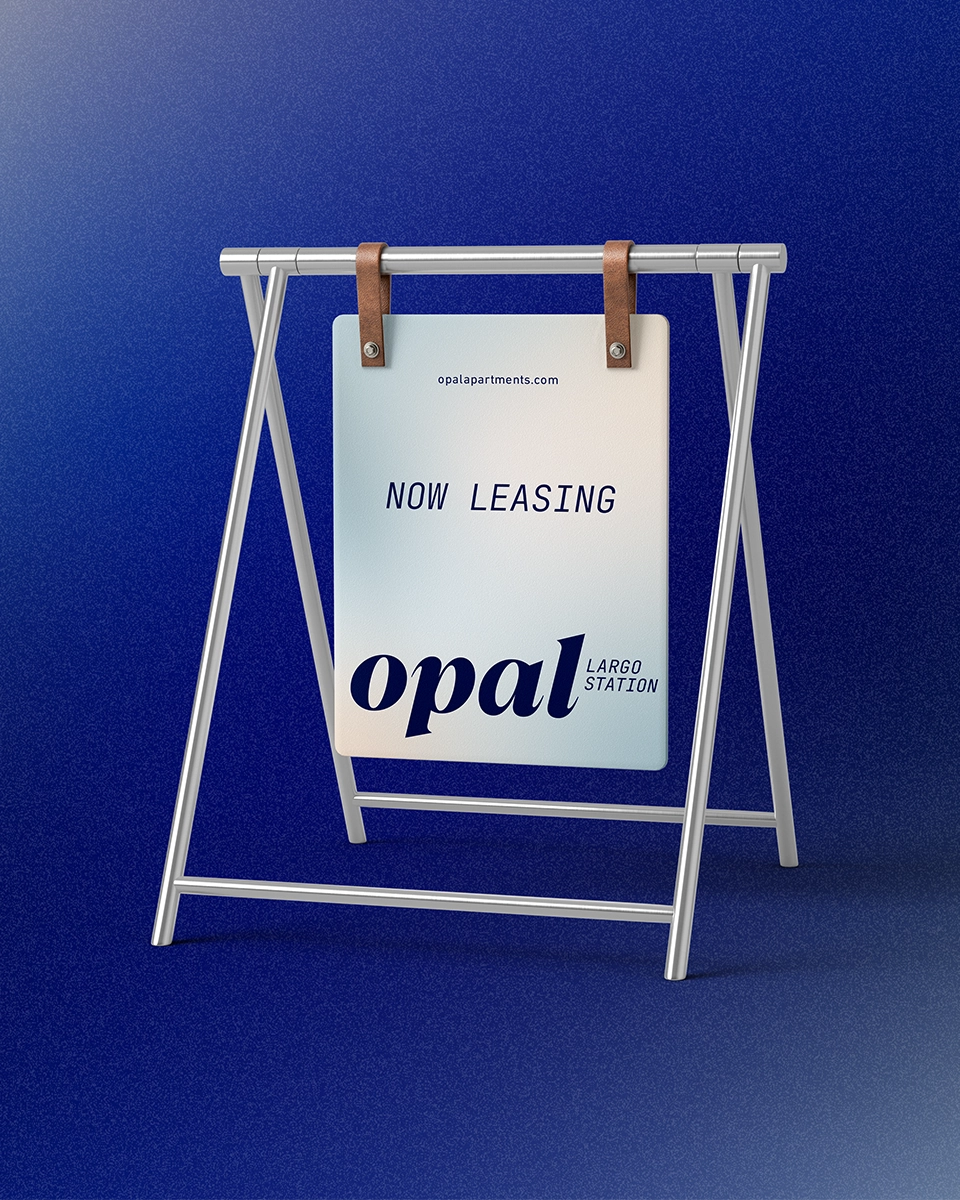
Printed pieces utilize the dual color palette and amorphous oval, giving the identity a dynamic look even on static materials.
Art Direction
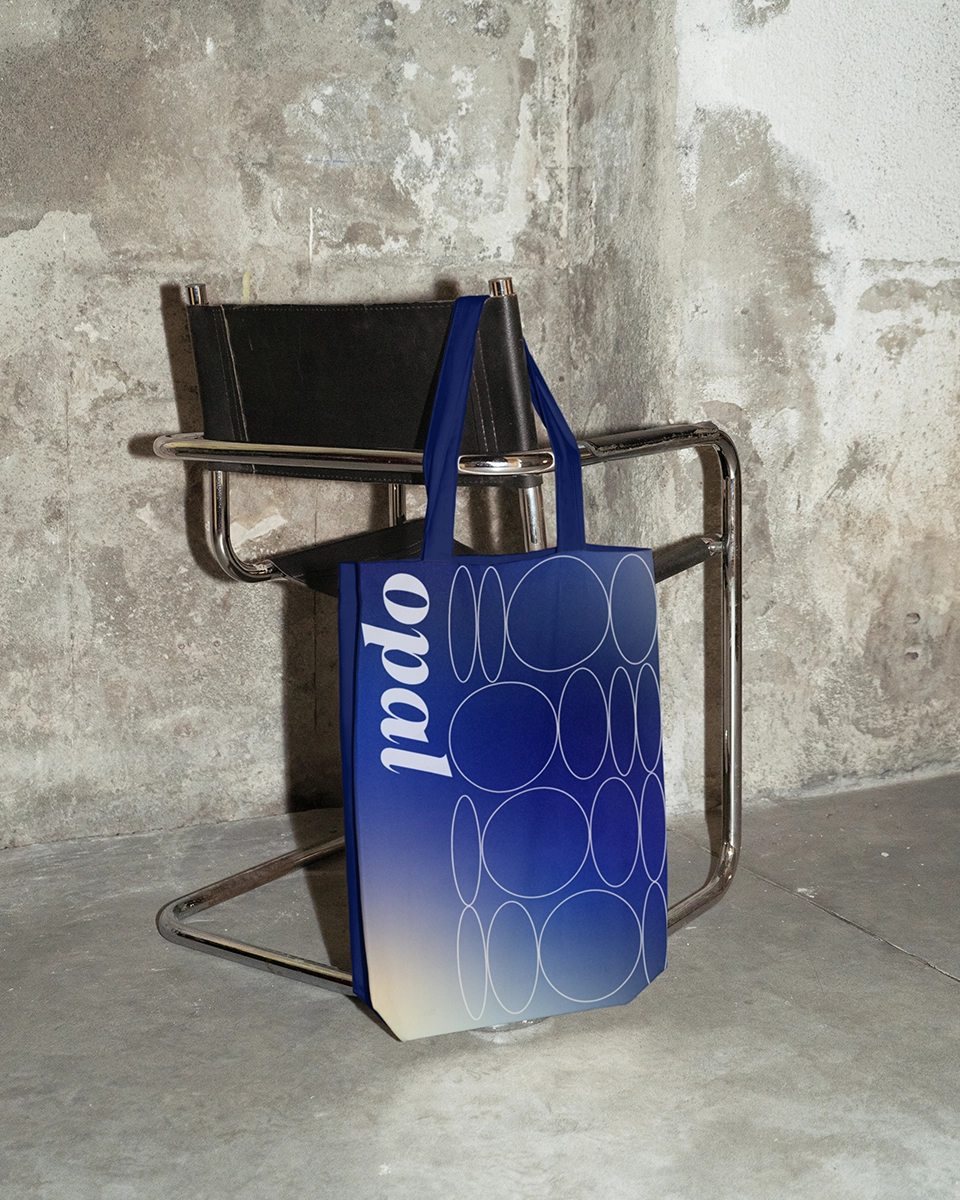
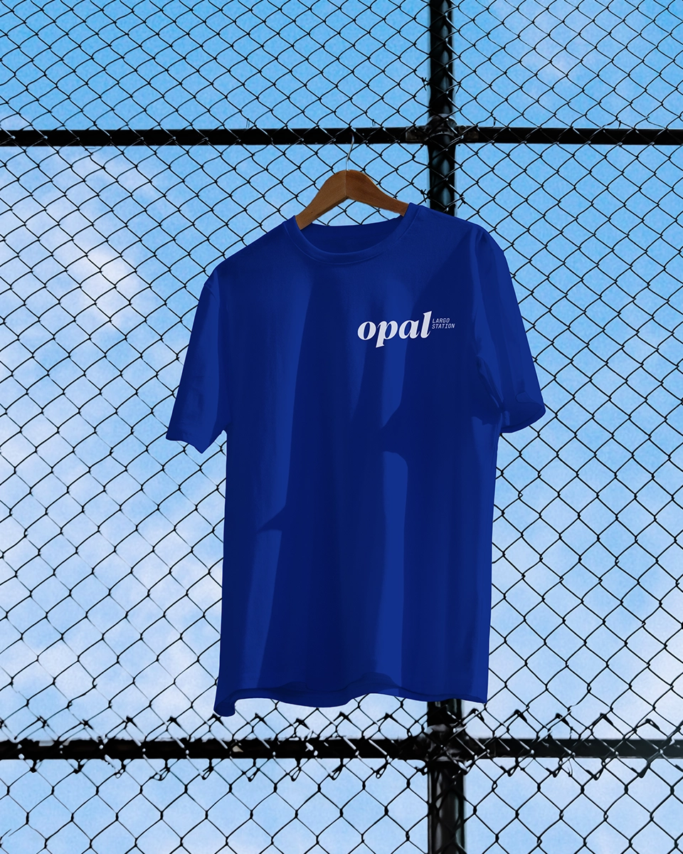
The identity has more than a few distinct elements apart from the ovals, the combination of which makes the identity stand out even without ovals as the focal point.
SIGNAGE
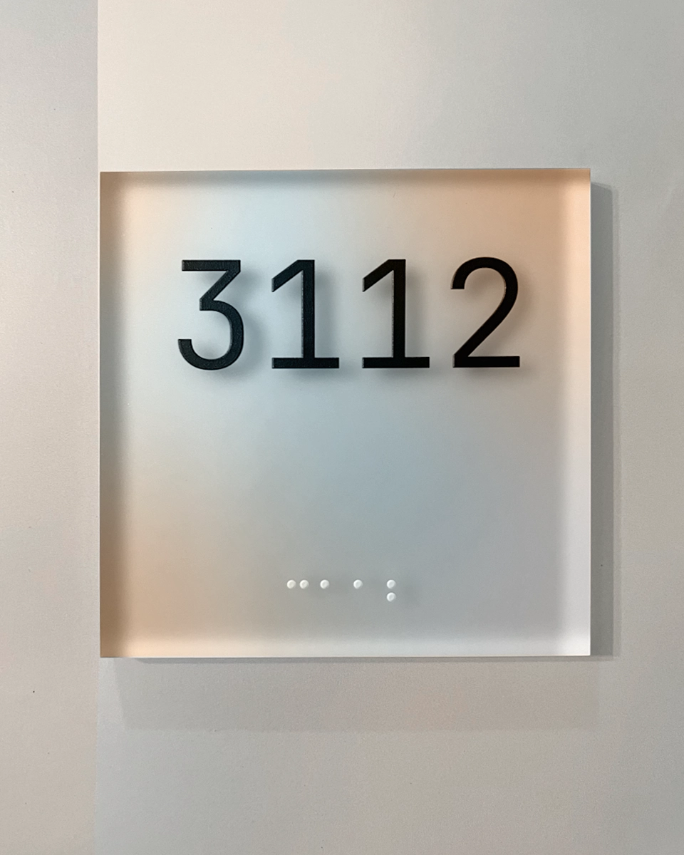
The ethereal quality of the visual identity translated well to signage and wayfinding. The clever use of frosted materials, glowing and dynamic lighting, and oval elements created a stunning visual experience in the physical environment.
