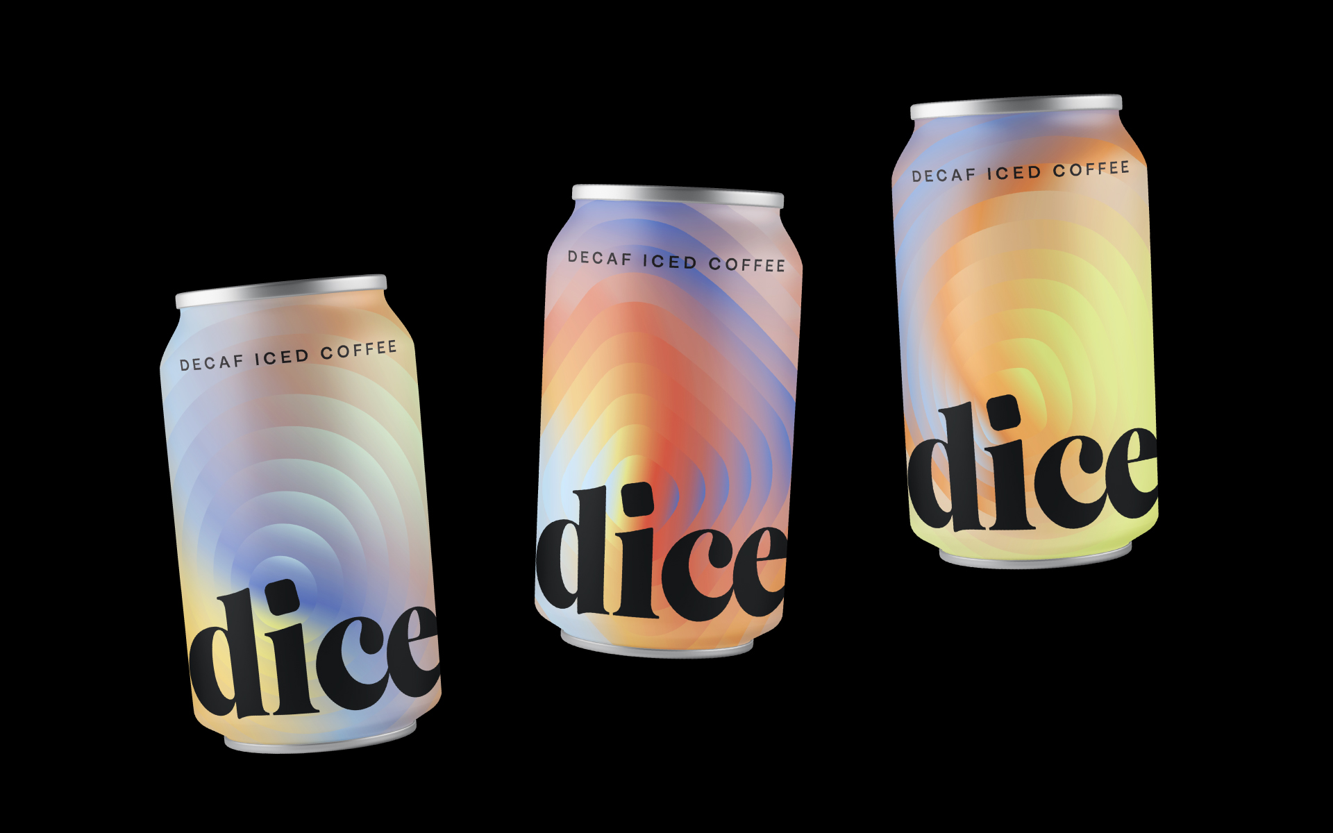
Dice Coffee
Brand Identity
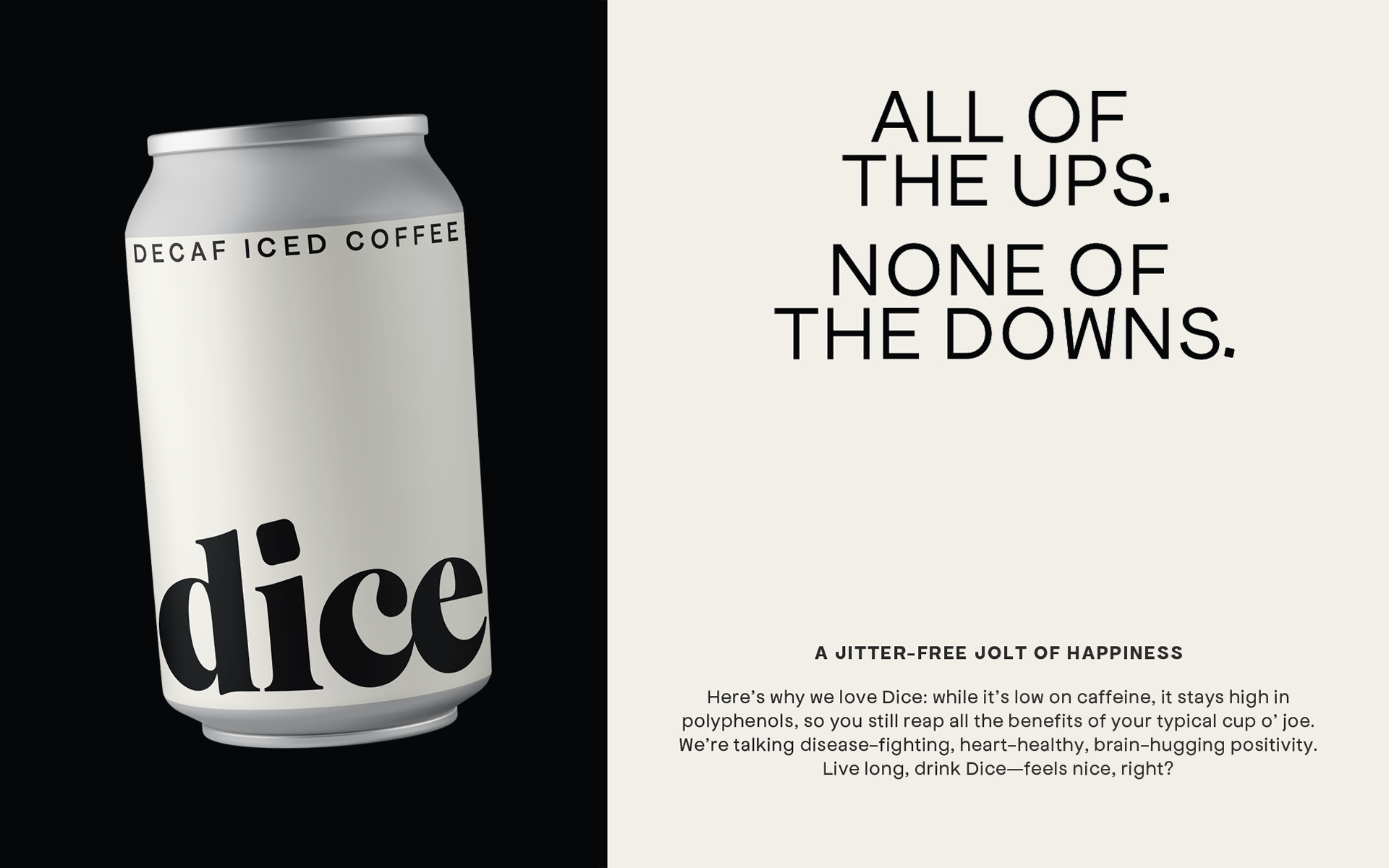
Dice (Decaf Iced Coffee) is an independent label that offers high-quality coffee with a near-negligible caffeine count. It's perfect for people who want to enjoy the flavor of coffee without the jitters.
With such a niche offering in a crowded canned coffee market, it needed to stand out on the shelves. With that in mind, I crafted a bold, confident, and clever visual identity for Dice.
ROLE
Art direction
Graphic design
Packaging design
Illustration
Motion graphics
CREDITS
Fat Lip, strategy, positioning, and copywriting
IDENTITY
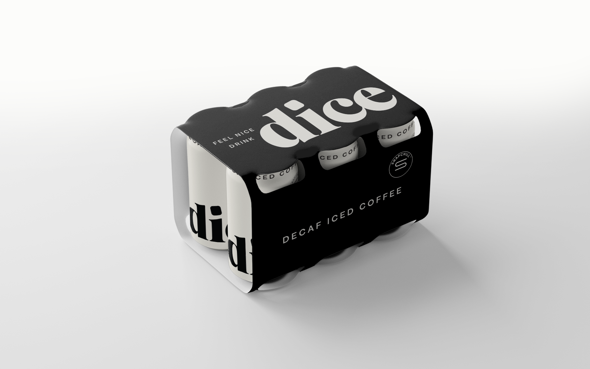
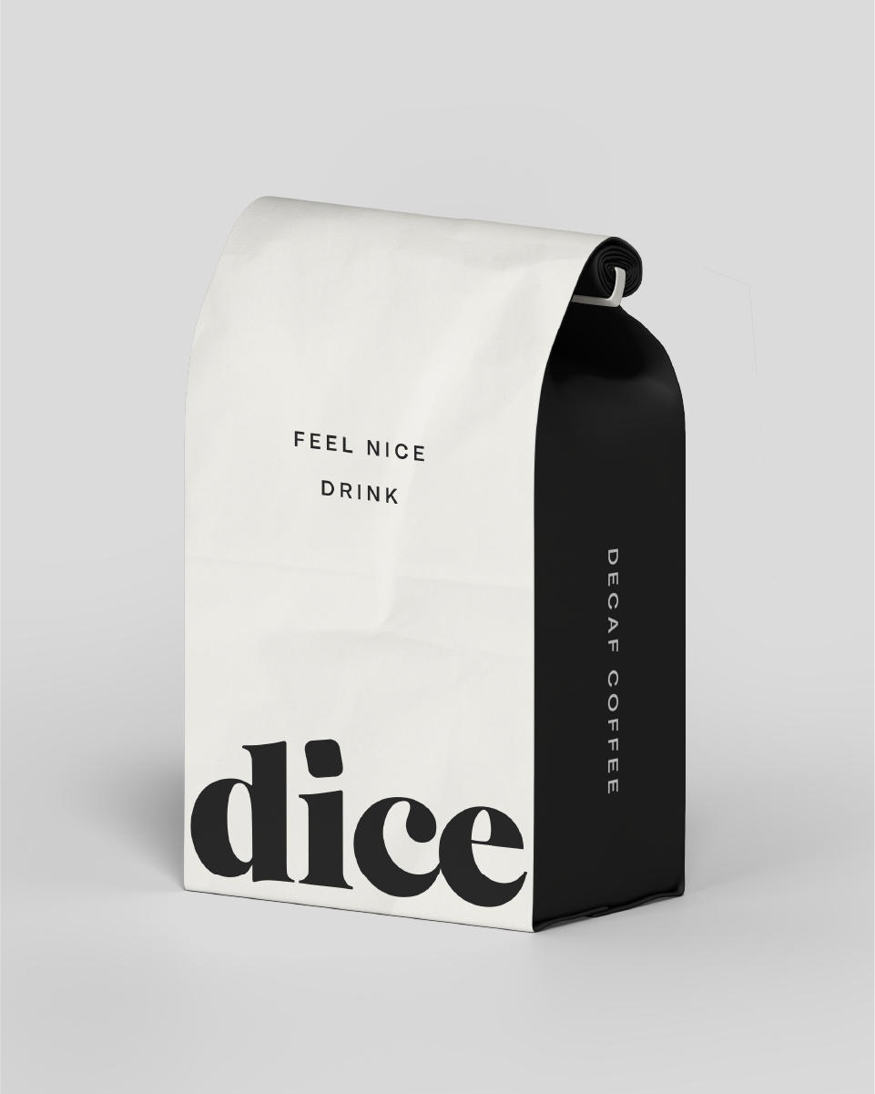
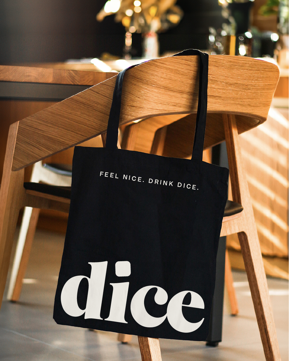
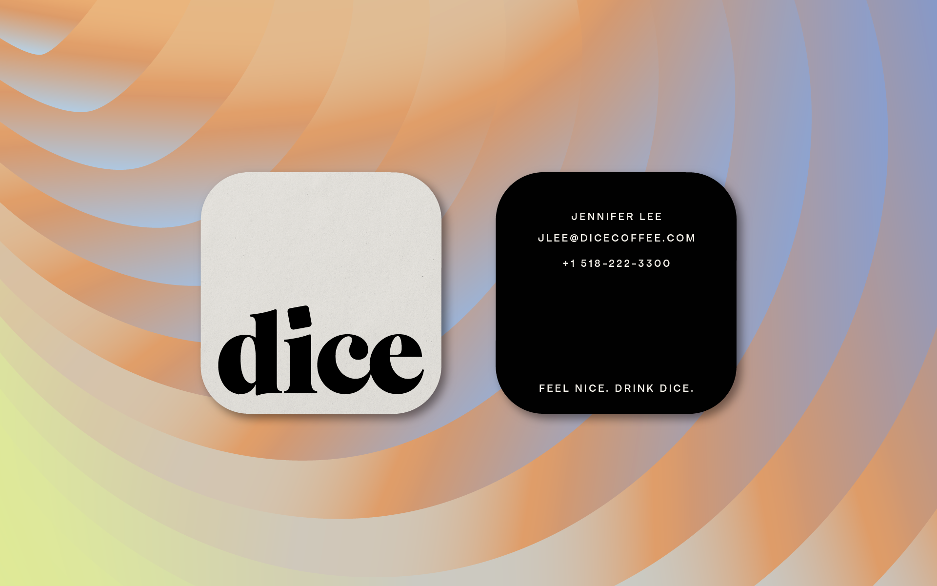
The logo hinges on the visual pun of ice/dice while the logotype is set in a bold serif font for maximum visual impact.
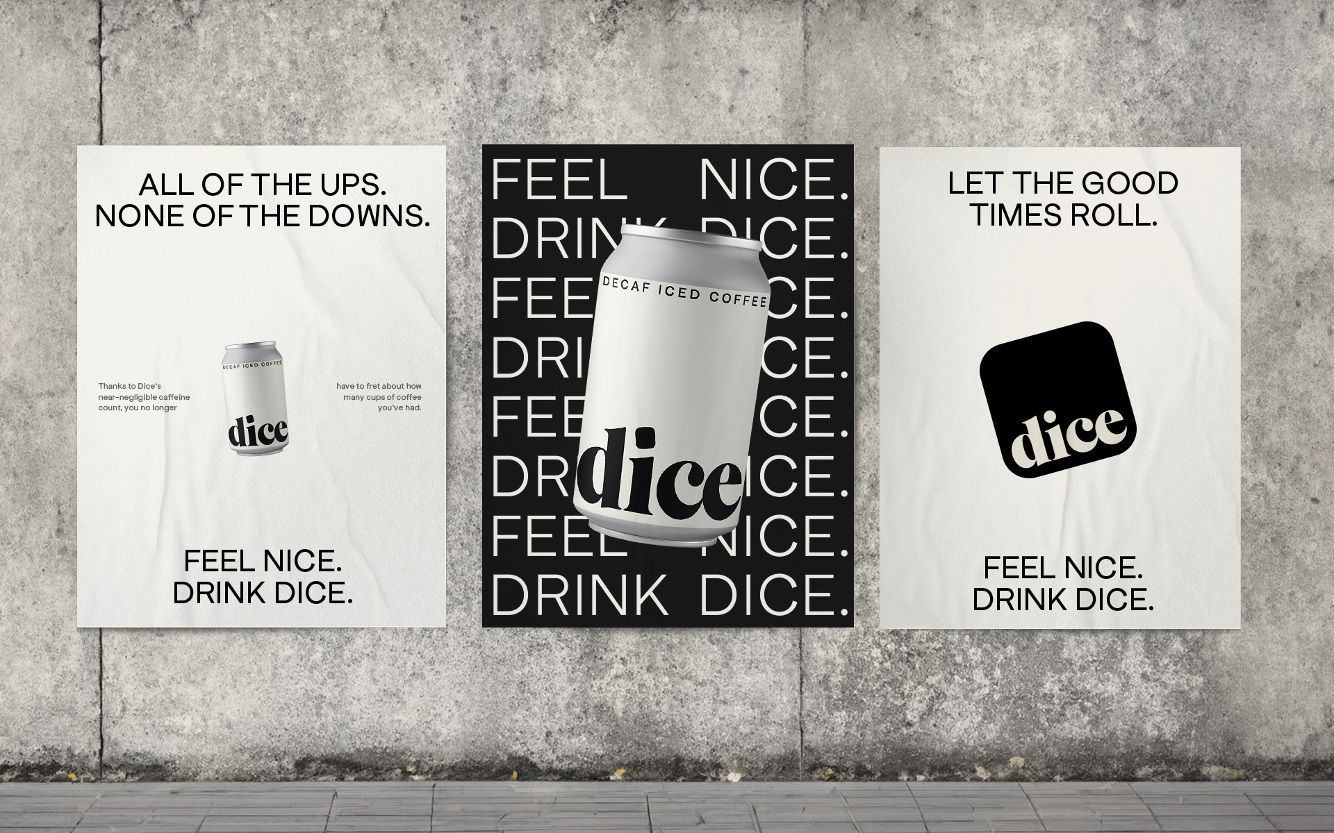
All other elements are pared back, keeping the visuals striking but not overstimulating. This approach makes the clever messaging and tone of voice shine.
Bringing in color
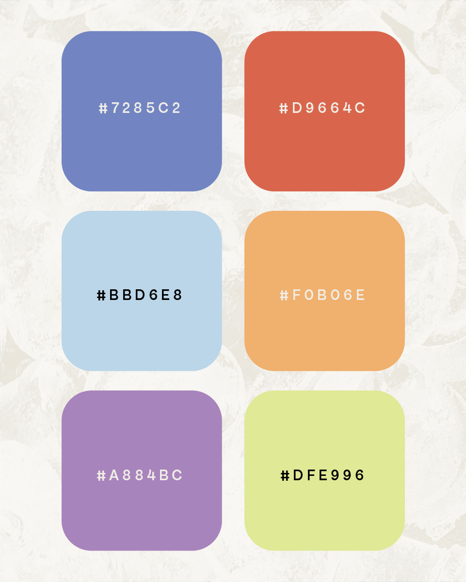
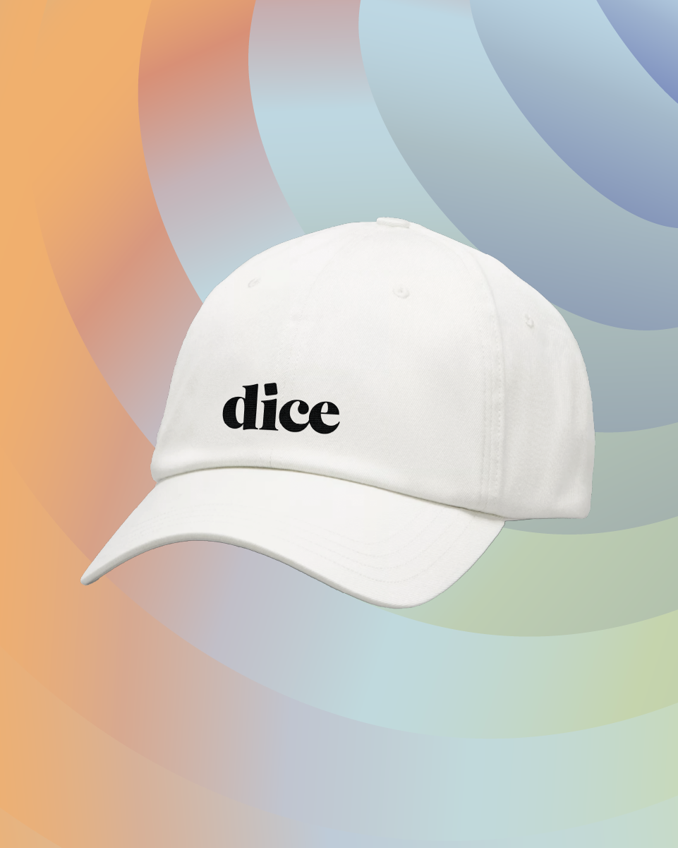
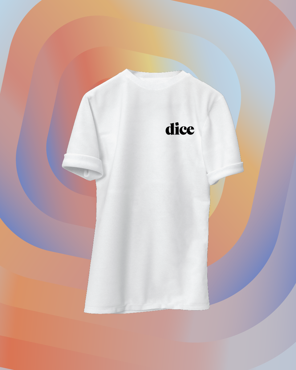
The expanded color palette brings an uplifting and playful feel to Dice. Dubbed the "just right" palette, the secondary colors aren't at full saturation but aren't dull at all. Any of them can be combined to create harmonious gradients that liven up the identity.
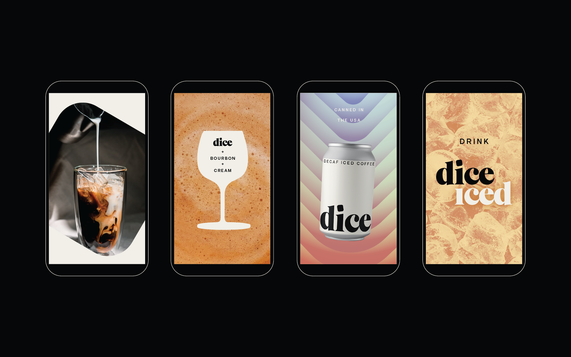
Illustrations were designed to demonstrate how anyone can enjoy Dice—shaken, spiked, or in a smoothie.
special edition Dice
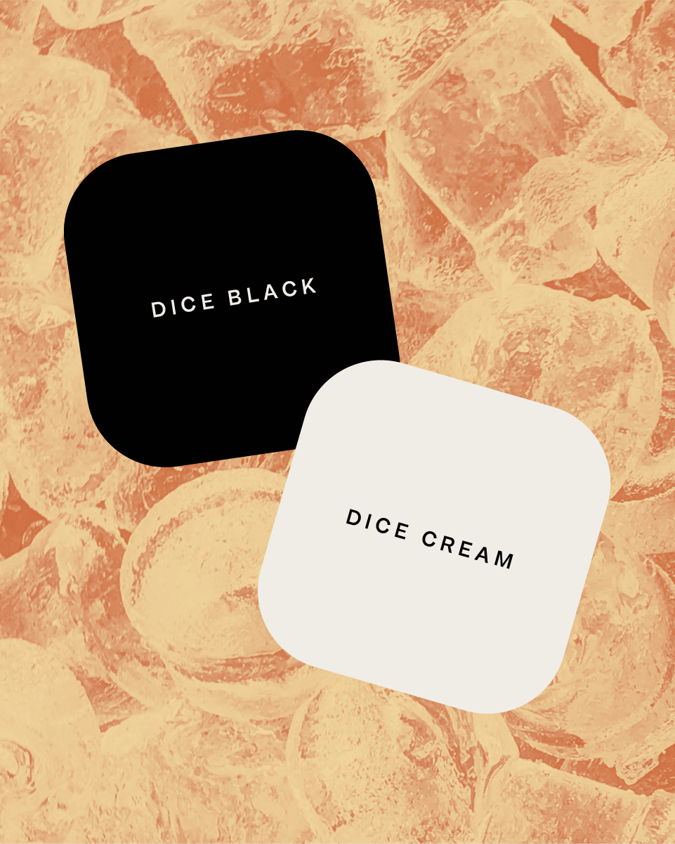
The simplicity of the can design brings opportunities to play with special edition packaging in the future.
