Haribar Lounge
Branding & Identity
Nestled in a luxury resort in Samal, Davao, Haribar Lounge is an exclusive spot inspired by the majestic Philippine eagle, symbolizing power and prestige. It offers an unparalleled experience for those who soar high in their fields, where the elite gather to celebrate their successes and forge new heights.
Services
Art direction
Visual identity
IDENTITY
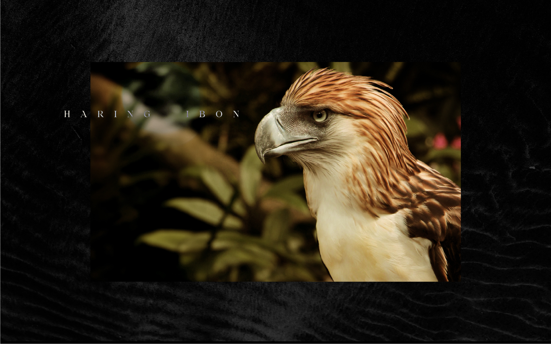
Haribar is a portmanteau of Haring Ibon (Philippine eagle) + Bar. The majestic bird is known for its size and strength and is an important cultural symbol of the country.
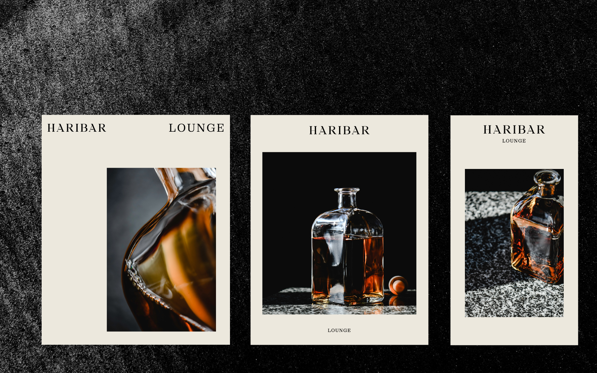
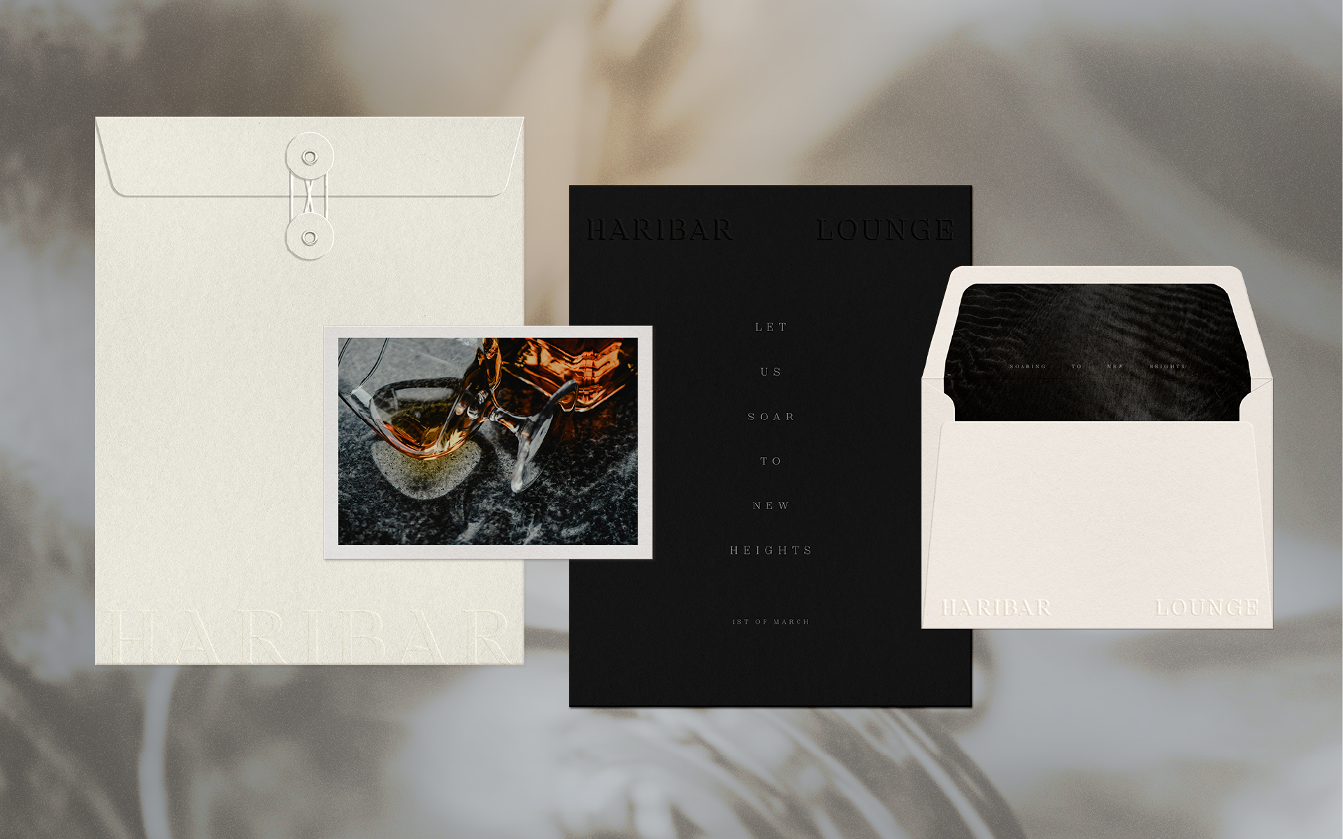
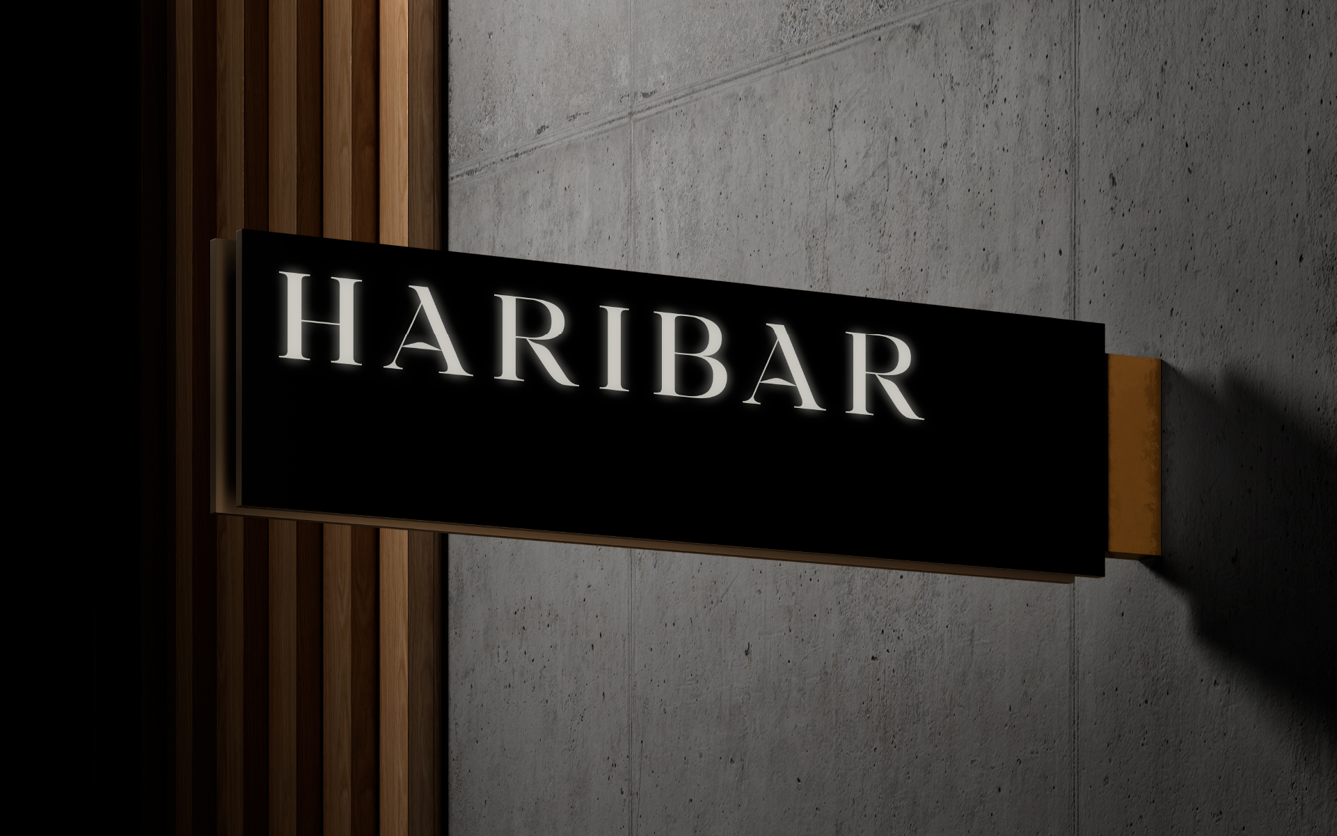
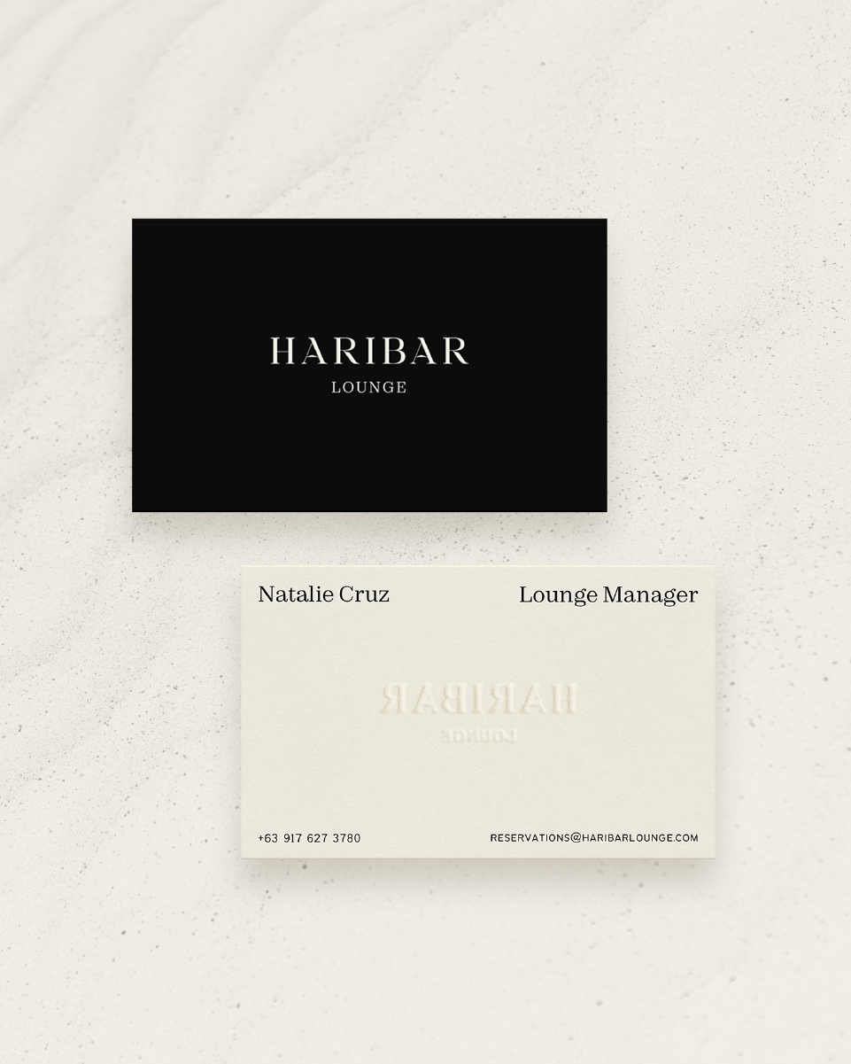
The brand identity reflects the eagle's regal nature and is complemented by a high-contrast color palette with rich browns and deep natural tones.
Filipino typography
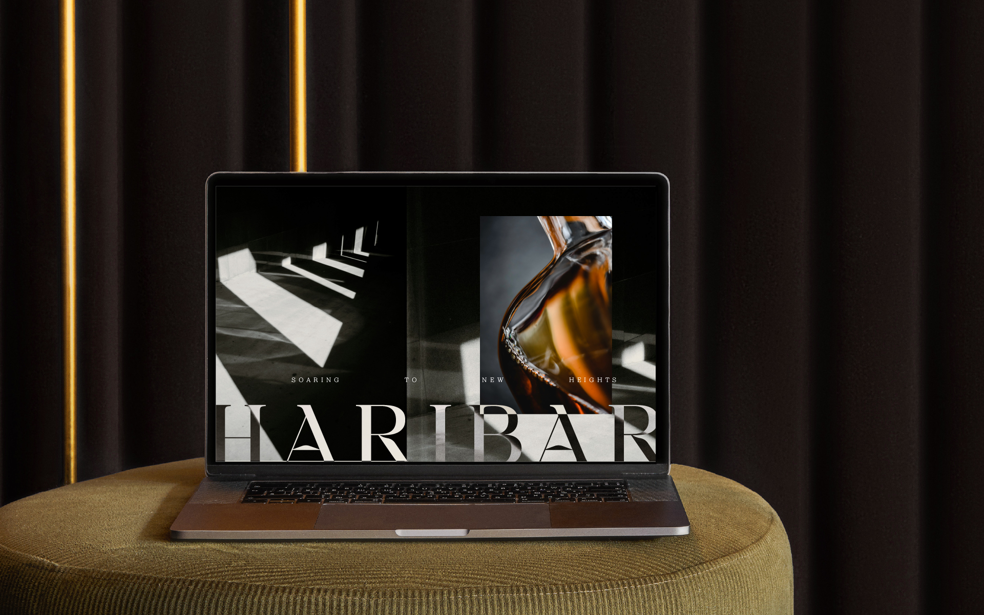
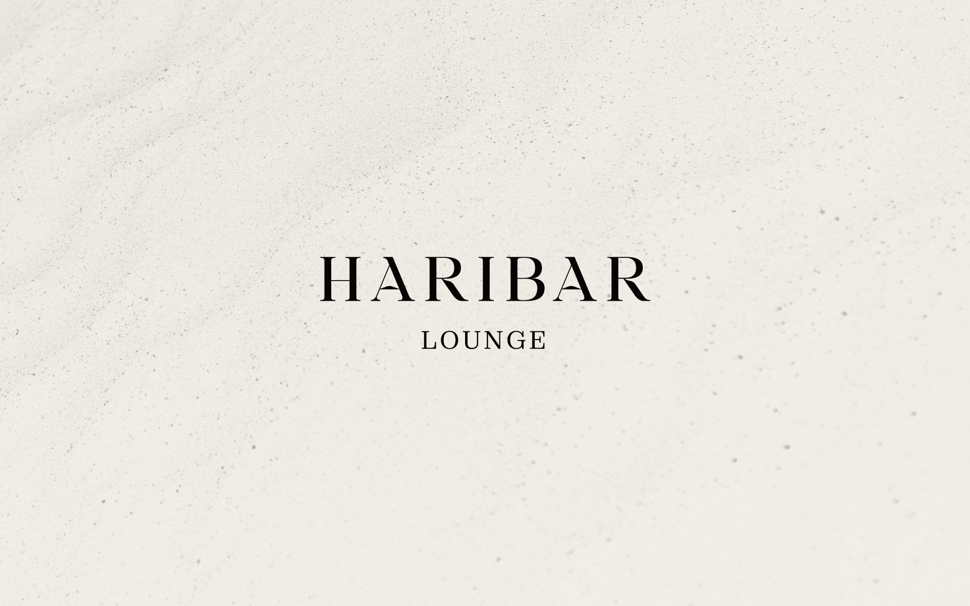
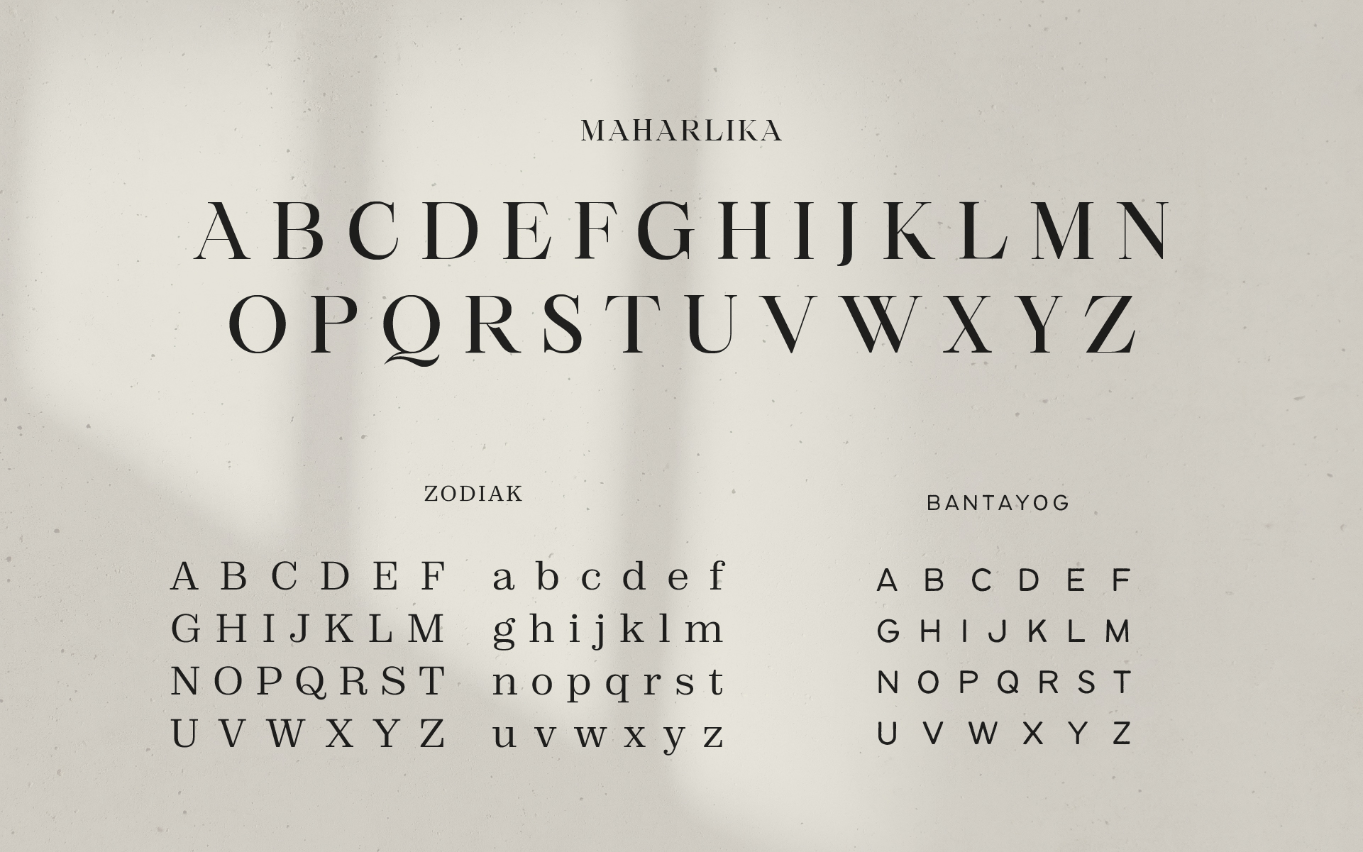
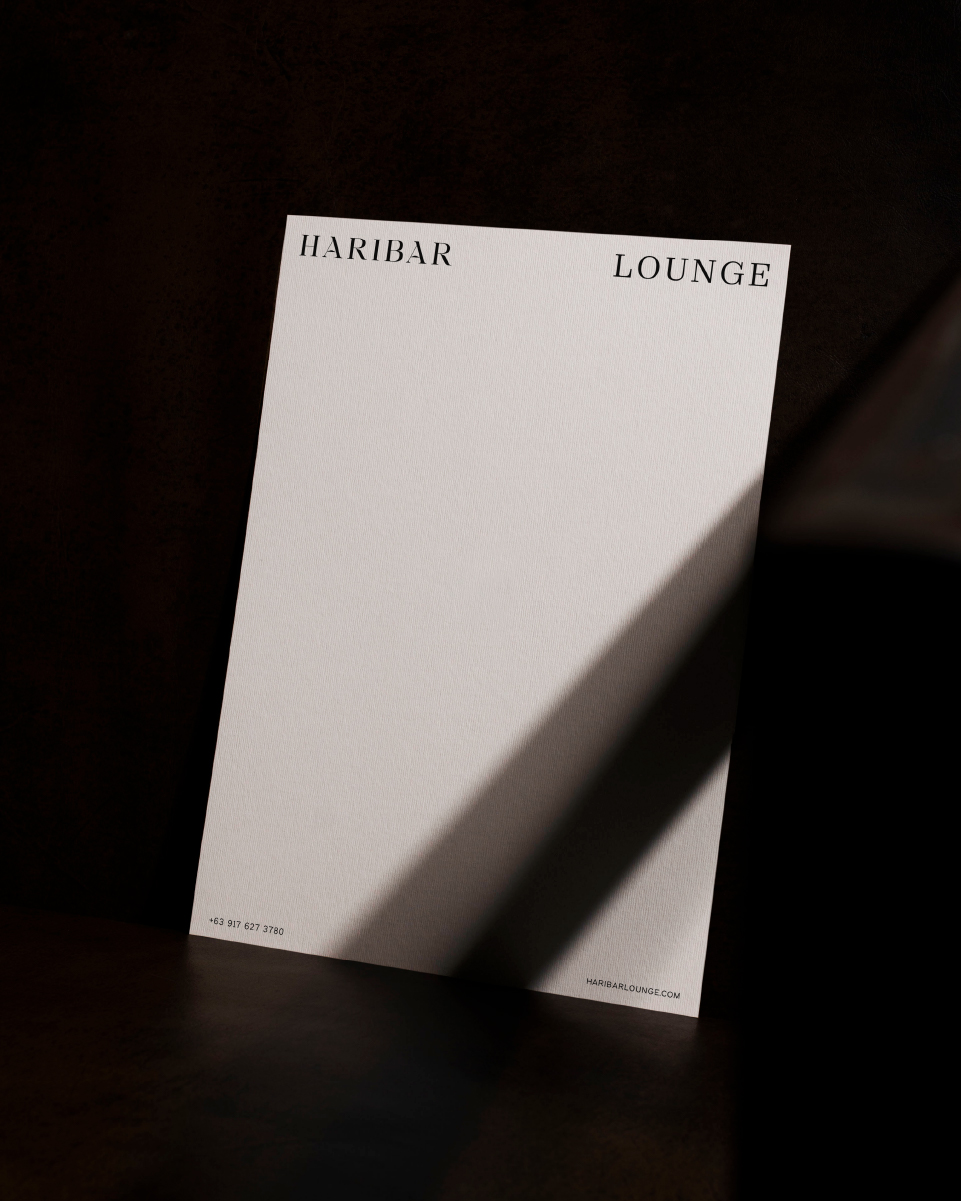
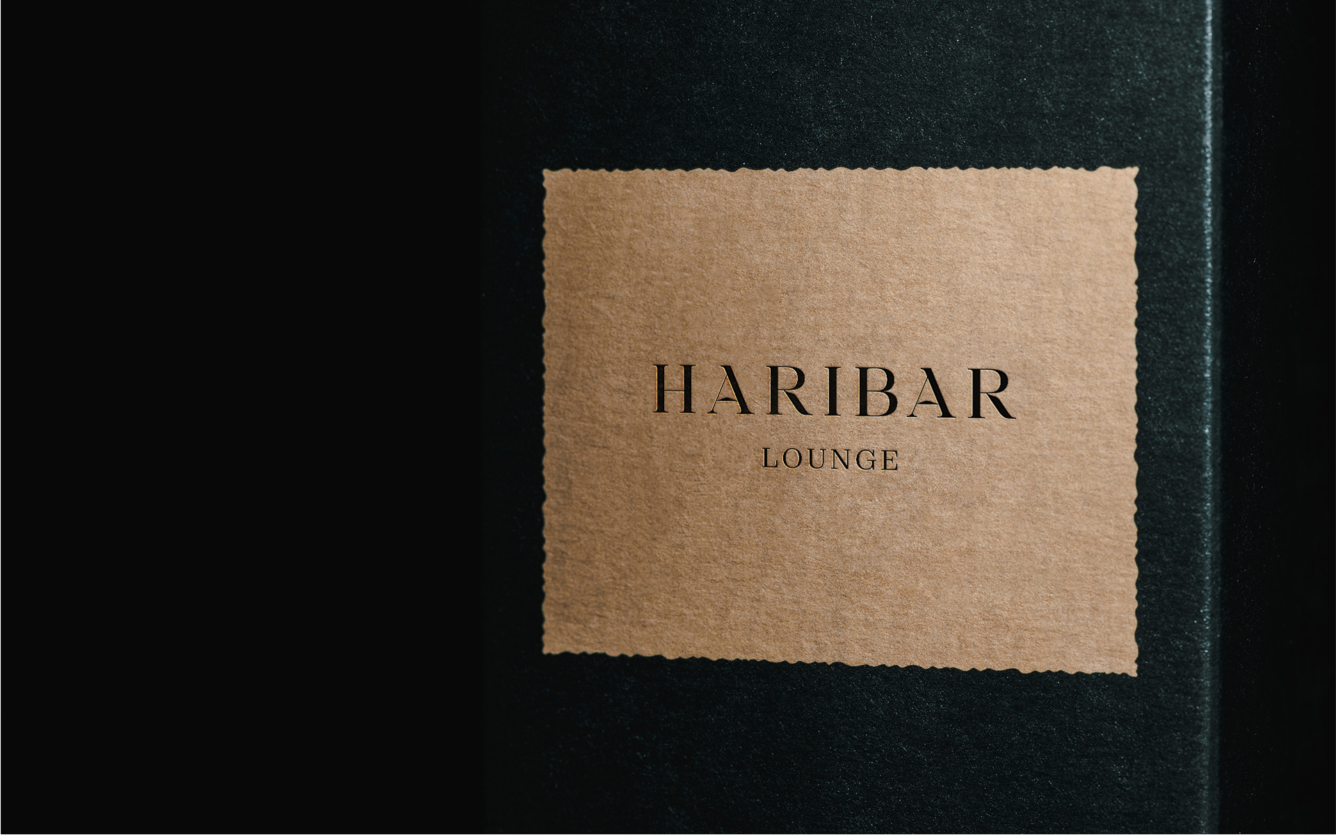
Maharlika by Ismael Dayag was selected as the logo typeface for its elegance and unique letterforms. Its sharp serifs are akin to eagles' beaks and talons making them a perfect fit for the identity.
Bantayog by Jad Maza was chosen as a tertiary typeface to contrast the regal nature of Marahlika and add texture and character to the system's captions.
Art Direction
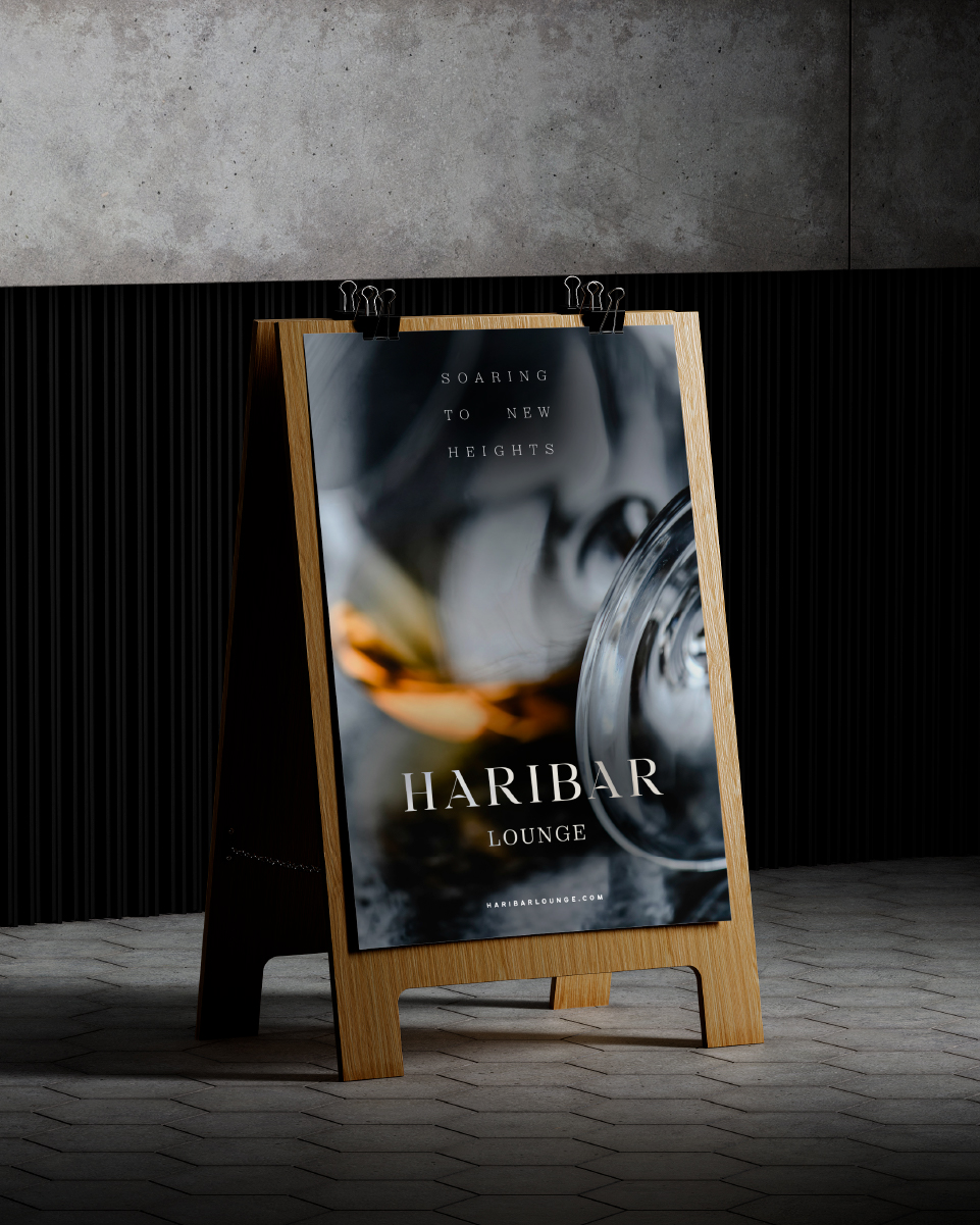
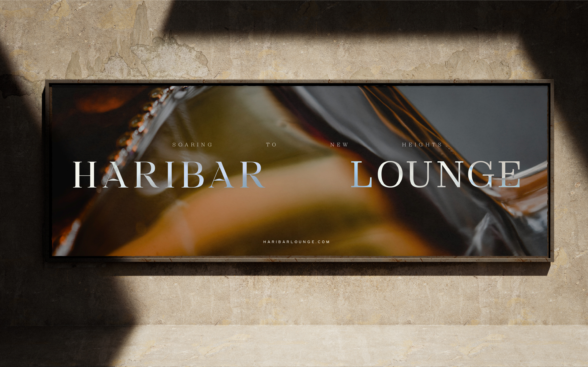
The art direction for Haribar focuses on creating striking visuals that combine the interplay of light and shadow, a deep appreciation for form, and an emphasis on the intricate details and rich hues of their premium spirits and liquor.
The goal is to craft a visual experience that is sophisticated and inviting, where every detail contributes to an atmosphere of elevated elegance and exclusivity. Photography by Eva Bronzini perfectly captures this direction and is used throughout the identity.
